What 165,000 monthly visitors find on every Mr. Rooter service page
Most national contractor sites we run Site Inspections on have one thing they do well and three things they neglect. Mr. Rooter Plumbing is different. Their service pages don't leave much on the floor. So we pulled up the three highest-traffic ones and broke them down from top to bottom.
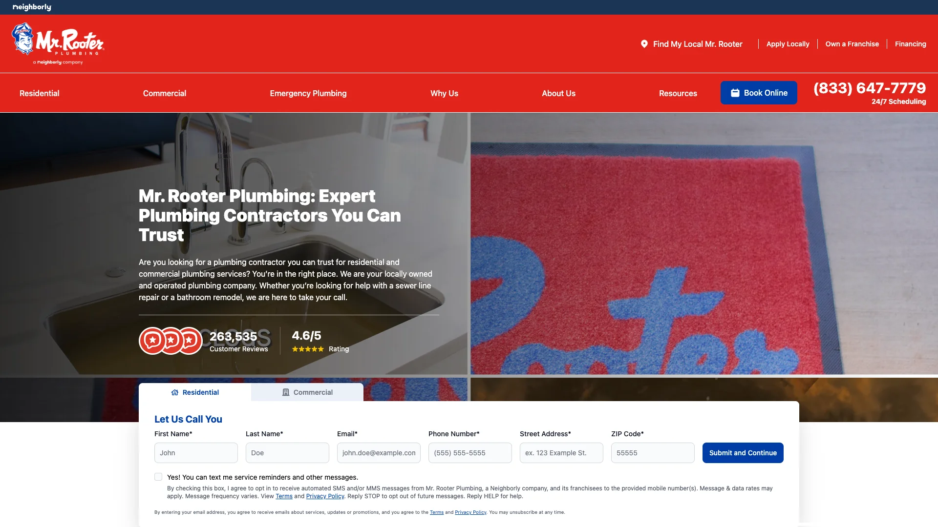
According to Ahrefs, mrrooter.com pulls about 165,700 organic visitors every month. The estimated traffic value sits around $771,400. That's the equivalent of three-quarters of a million dollars in paid search value, every month, earned through rankings rather than ad spend. The three service pages we inspected:
- /emergency-service/ — the emergency plumber page (about 16,100 monthly visitors)
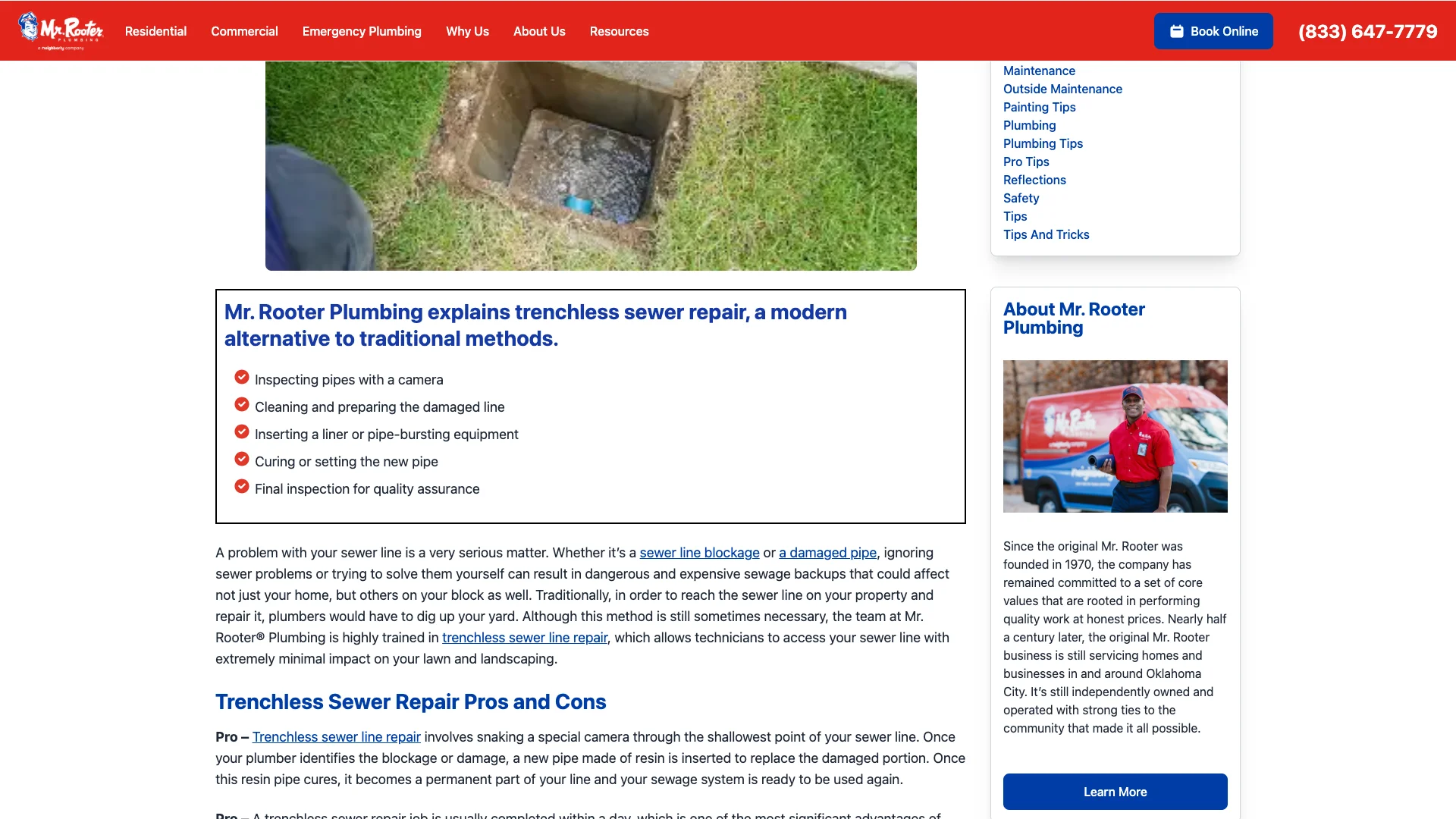
- /about/news/the-pros-and-cons-of-trenchless-sewer-repair/ — a long-form blog post (about 6,600 monthly visitors)
- /residential-services/drain-cleaning/ — drain cleaning services (about 6,600 monthly visitors)
And here's what every one of them carries, in order of appearance as the homeowner scrolls:
- A branded header with the phone number visible
- A service heading and a short description of the service
- A "Let Us Call You" inline form, right there, no click required
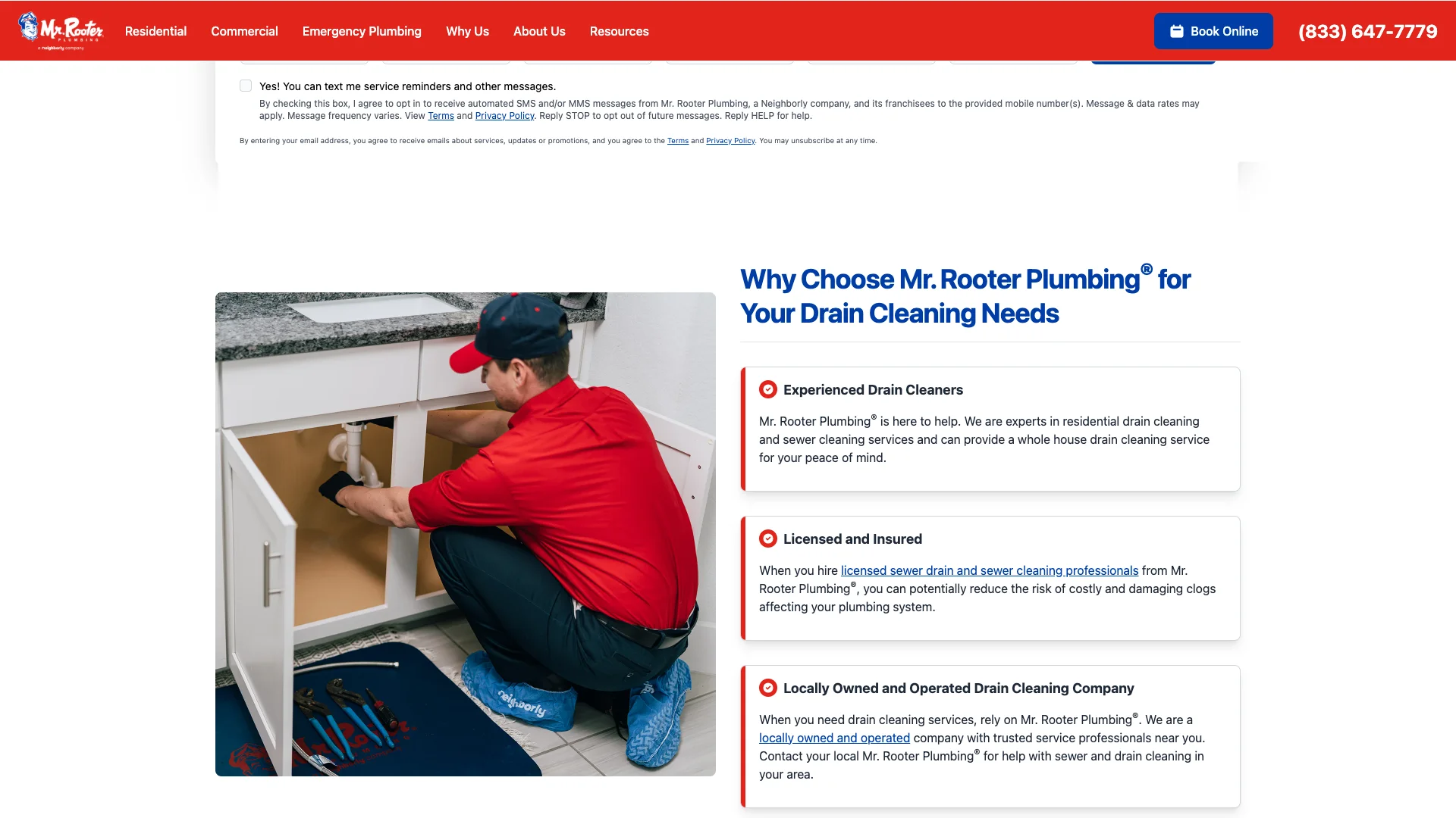
- A technician photo or service image
- A "Why Choose Us" block with three reasons (licensed, reliable, guaranteed)
- A "When to Call" or "What to Watch For" content section
- A "Residential & Commercial Services" grid linking to related pages
- A "Find a Local Service Provider Near You" list of about 40 cities
- A customer reviews section with three five-star reviews in branded cards
- A blog previews block plus expert tips section
- A frequently asked questions accordion, usually with five or six questions
- A second "Let Us Call You" inline form near the bottom
That's not a template that shipped with the franchise starter kit. That's a page someone built with actual conversion architecture in mind. The homeowner searching "emergency plumber" at 10 PM doesn't have to click anywhere to start booking. They don't have to scroll past an empty wall of text to find a review. They don't have to guess whether this company serves their area. Everything they need is laid out in a rhythm that earns their attention.
"Plumbing, water treatment, and outdoor services convert strongest at 12–16%."
— WebFX (2026)
Plumbing pages that convert well sit between 12 and 16 percent when the architecture is tuned. Mr. Rooter's is tuned. The next question is how. So we took the pieces apart.
The form strategy: six fields, twice per page
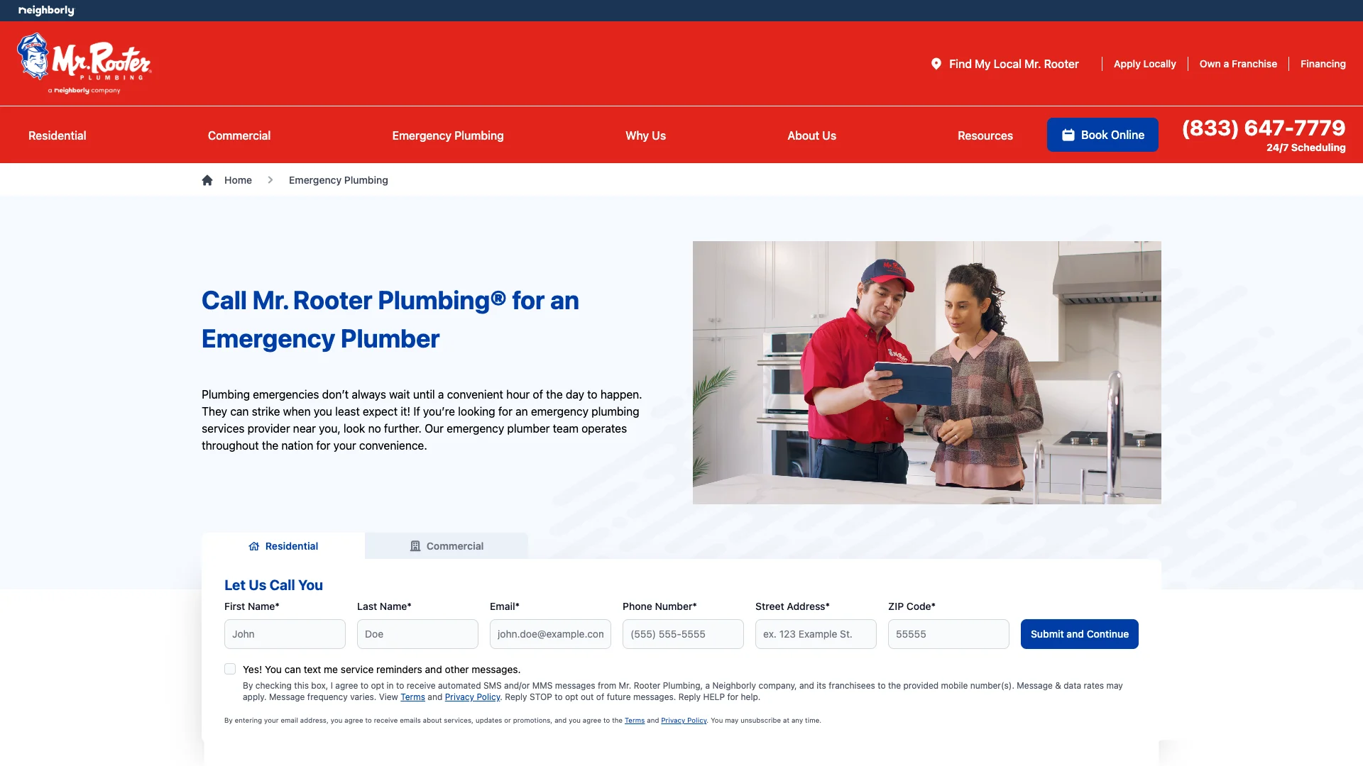
Open Mr. Rooter's emergency service page and the first thing below the hero is a form. Not a button that takes you somewhere else to find a form. An actual form. Six fields:
- Last name
- Phone number
- Email address
- Best days to reach you
- Street address
- Zip code
Six is a deliberate number. Not three, which plenty of CRO blog posts will tell you is the magic floor. Not ten, which is what enterprise scheduling wizards ask for. Six.
Comparison
"Removing four optional contact-form fields produced a 160% increase in submitted forms and a 120% lift in conversion rate."
— Imaginary Landscape (2008)
The numbers on form length are decades old and still hold up. Imaginary Landscape's 2008 case study cut four optional fields from its own contact form (physical address, fax, contact-preference, and "how did you hear about us") and saw a 160% increase in submissions and 120% increase in conversion rate. Baymard Institute's e-commerce checkout research, refreshed each year, finds the typical checkout asks 11.3 fields when a fully-optimized version runs around 8. The direction is unambiguous: every field you add is friction, and the friction is measurable. So the math question every plumbing contractor has to answer is: what information do you actually need before the call? Name and phone is the absolute minimum. Zip code is how you route the lead to the right team or partner location. Email is how you follow up if the phone doesn't answer. Address is how you skip a step when the homeowner eventually books. And "best days to reach" is a soft qualifier that weeds out tire-kickers without adding real friction.
"The average e-commerce checkout asks 11.3 form fields in 2024, while a fully-optimized checkout runs around 8."
— Baymard Institute (2024)
Every one of those fields earns its keep. There's no "how did you hear about us" dropdown. No "tell us about your project" free-text field that most visitors will stare at and then close the tab. The form is tuned to collect what the dispatcher needs and nothing else.
And the layout is important. Fields are stacked in a two-row grid, not a ten-item vertical scroll. The submit button is prominent. There's no captcha visible on the first render. Nothing asks for a password. The form is a form, not a checkout experience.
Why the same form appears top and bottom
The same six-field form repeats at the bottom of every service page. Exactly the same fields. Exactly the same submit action. This isn't a design oversight. It's conversion architecture 101 applied with confidence.
"Pages with a single repeated CTA goal outperform pages with competing CTAs by 20–30% on average."
— Apexure (2026)
Apexure's CRO testing across their client base in 2026 found that pages with one repeated call to action outperform pages with competing calls to action by 20 to 30 percent. The key word is "repeated," not "multiple." A page with three "Book Online" buttons pointing to the same thing converts better than a page with a "Book Online" button, a "Schedule Appointment" button, and a "Request a Quote" button, each pointing somewhere different. The repetition reinforces. The variety confuses.
Mr. Rooter's page obeys that rule. The top form, the bottom form, the phone number in the sticky header. All three paths lead to the same outcome: the homeowner hands over their contact information and someone calls them back. The wording changes slightly ("Let Us Call You" versus "Schedule Service" in the header), but the underlying action is identical.
So why two forms instead of one? Because a homeowner who doesn't submit at the top of the page might scroll. And a homeowner who scrolls through reviews, FAQs, and service details and gets convinced along the way shouldn't have to scroll back up to convert. The second form catches them exactly where they finished reading. (It's the same reason supermarkets put gum at the checkout and not at the entrance. The second touchpoint catches what the first one missed.)
The trust infrastructure around the forms
A form on its own is a request. Without context, the homeowner has to decide whether to trust the company before they hand over their phone number. Mr. Rooter solves that with a layer of social proof sitting directly between the top form and the bottom form.
Every service page includes a "Customer Reviews" block with three reviews. Each review is a five-star rating in a branded card with the customer's first name and last initial plus a short testimonial about their experience. Not a carousel that autoplays and makes the homeowner chase it. Not a widget that takes two seconds to load. Three reviews, visible on initial render, with enough detail to feel like they came from real people.
"Displaying five or more reviews on a product page lifts conversion rates by up to 270% compared to product pages with zero reviews."
— Spiegel Research Center, Northwestern University (2017)
The Spiegel Research Center at Northwestern found that simply showing five or more reviews on a product page can lift conversion by up to 270 percent over pages that display none. Not surprising when you consider the alternative. A plumbing company that asks for your phone number but shows zero evidence that anyone else has used them and been satisfied is asking you to trust them on their word alone. That's a bigger ask than it sounds.
And Mr. Rooter doesn't stop at reviews. The service pages also carry:
- An FAQ accordion with five or six questions that actually get asked ("How much does drain cleaning cost?", "Is there a warranty?", "What should I do while waiting for the plumber?"). Expandable, so the page stays clean.
- A "Why Choose Us" block with three plain-language reasons: licensed and insured, upfront pricing, and a workmanship guarantee.
- A "Residential & Commercial Services" grid that signals the company handles every kind of plumbing job, not just the one the homeowner landed on.
- A "Find a Local Service Provider" city list with about 40 cities. That's both an SEO play and a trust signal. If the homeowner's market shows up in the list, they know the company actually serves their area.
- Blog post previews and expert tips below the reviews, giving the page editorial credibility and a reason to stay on the domain.
Each of those elements takes a different slice of the trust problem. Reviews prove quality. The FAQ pre-empts objections. Why Choose Us answers the "are you legit" question. The services grid proves scope. The city list proves coverage. Any one of them on its own would be weak. Stacked together, they carry the homeowner across the "do I trust you enough to give you my phone number" line without the company ever having to say "trust us."
Real-user speed that matters more than the lab score
Here's where things get interesting. If you run Mr. Rooter's service pages through Google's mobile lab test, the scores come back in the low 30s. That's not a great number on its own. It would make a CRO inspector's eyebrows go up. But lab scores are simulations. They run on an artificially throttled connection and an emulated device. They're a red flag detector, not a user experience measurement.
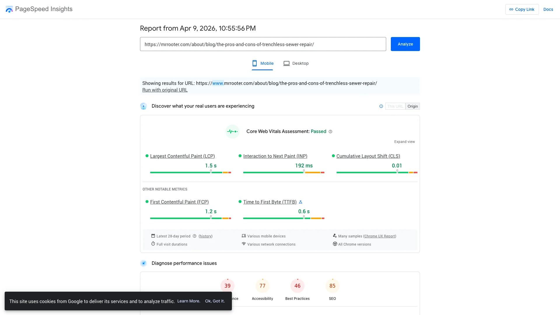
So we pulled the real-user data instead. PageSpeed Insights on April 15, 2026, showed Mr. Rooter's three service pages clearing Google's Core Web Vitals on all three counts:
- Emergency service page: Main content appears in 1.8 seconds. Interaction delay 188 milliseconds. Layout shift 0.
- Drain cleaning page: Main content appears in 1.5 seconds. Interaction delay 194 milliseconds. Layout shift 0.01.
- Clogged drains page: Main content appears in 1.5 seconds. Interaction delay 194 milliseconds. Layout shift 0.01.
All three pages pass. That's real homeowners on real phones on real networks, measured over a 28-day window. The homeowner lands on the page, the content appears in under two seconds, the form is tappable within another fifth of a second, and nothing jumps around while they're trying to read it.
Comparison
"When Rakuten 24 optimized its Core Web Vitals, conversion rate climbed 33.13% and revenue per visitor rose 53.37%."
— web.dev case study, Google (2021)
The Rakuten 24 case study documented by Google found that improving Core Web Vitals produced a 33.13 percent lift in conversion rates and a 53.37 percent lift in revenue per visitor. Those are enormous numbers. Not every site gets that kind of result. But the direction is clear. Fast pages convert more. Pages that clear Core Web Vitals convert more. Mr. Rooter's architecture is heavy with content, forms, images, and interactive elements, and the pages still load fast enough to clear Google's threshold. That takes engineering attention. It's not an accident.
And it's the answer to the "but my site has to be fast" objection. Fast doesn't mean empty. Mr. Rooter's pages are dense with trust infrastructure, and they still load quickly. So the tradeoff between speed and substance is mostly false. You can have both if you build the page with care.
How the Neighborly franchise model scales this architecture
Mr. Rooter is one of 19 brands in the Neighborly Brands portfolio, which operates thousands of franchise locations across North America. That scale is important because it explains how the architecture gets built and maintained.
A local plumber running one shop can't necessarily afford to build this kind of site from scratch. Mr. Rooter doesn't have to. The site is a corporate asset, maintained by a central marketing team, deployed consistently across every location that uses the template. The individual franchise owner in Dallas or Cincinnati doesn't decide where the form goes. The template decides. And because the template is maintained by people whose full-time job is conversion, every location benefits from the same tuning.
That's the upside of a franchise model done well. The downside, for the franchise, is that local markets can't customize the page for their specific service area, seasonal patterns, or local competitors. The Dallas page and the Cincinnati page look the same. Which is fine when the template is this good. And harder when the template isn't.
For the local plumber reading this article, the lesson is inverted. You don't have corporate marketing. But you don't have corporate constraints either. You can customize your service page for your zip code, your service area, your local competitors, your seasonal patterns. The template that serves 1,000 locations has to compromise. The template that serves one location can be exactly what your market needs.
What a local plumber can copy (and what to skip)
So what does this teach a plumber with 500 monthly visitors instead of 165,000? Most of it is copyable. A little isn't.
Copy this:
- A six-field form at the top of every service page. Last name, phone, email, best days, street address, zip. Not three fields. Not ten. Six. Collect what the dispatcher actually needs.
- The same form at the bottom. Not a different form. The same one. The homeowner who scrolls deserves another chance to convert without scrolling back up.
- Three customer reviews directly on the page. Not a carousel. Not a widget. Static cards with a name, a rating, and a testimonial. Visible on initial render.
- A short FAQ accordion with five or six questions that real homeowners actually ask. "How much does it cost" belongs at the top.
- A "Why Choose Us" block with three plain-language reasons. Licensed and insured. Upfront pricing. Workmanship guarantee.
- A services grid that signals you handle more than the one service the homeowner landed on.
- A city or service area list so the homeowner confirms you serve their zip code before they fill out the form.
- A persistent header with your phone number that stays visible as the homeowner scrolls.
Skip this:
- The blog preview block unless you actually maintain a blog. Empty preview cards linking to three-year-old posts hurt more than they help.
- The 40-city service list unless you actually operate in 40 cities. For a local shop, a three-to-five-city list is more honest and more useful.
- The national brand credibility signals (Neighborly logo, multi-million review counts). You can't fake these. You have different trust signals to leverage instead. See below.
Use instead of the national-brand signals:
- Your face and your name at the top of the page. "Call Mike directly" with a photo beats any stock technician image.
- Your license number visible in the hero. National brands usually bury this in a footer. You can feature it.
- Your years in the specific city you serve. "Serving Haldeman homes since 2008" lands harder than "over 5.5 million customers served since 1994."
- Your actual Google review count and rating, not a vague "trusted by thousands." If you have 89 reviews at 4.9 stars, say that. Specifics beat superlatives.
Revenue multiplier
"Phone calls convert to 10-15x more revenue than web leads for home services businesses."
— BIA/Kelsey + Forrester (2025)
And one more thing that Mr. Rooter does right and that you should match: keep the phone number as the primary conversion path. BIA/Kelsey and Forrester research from 2025 found that inbound phone calls convert to 10 to 15 times more revenue than web form leads in home services. The form is there for people who won't call. The phone is there for everyone else. Both matter. Neither replaces the other.
Five questions for your own plumbing site
These aren't generic CRO tips. They come straight from the architecture breakdown above. Answer them honestly against your own service page.
1. Can a homeowner submit their contact information from your service page without leaving it? Open your most-visited service page right now. Is there a form on it, visible above the fold? Or do they have to click "Contact Us" and land on a separate page first? Every extra click between interest and submission is where people drop off.
2. Are there three customer reviews visible on the page itself? Not on a separate reviews page. Not inside a widget that pops up when you scroll. On the service page, in the body, visible by the time the homeowner has finished reading about the service. If not, add them.
3. Does your site load its main content in under two seconds on a real phone? Not a lab test. A real phone. Run your top page through PageSpeed Insights and look at the real-user data. If the main content appears in under two seconds and Core Web Vitals pass, you're in the same performance band as Mr. Rooter. If it's slower, that's fixable and it's worth fixing.
4. Is the same call to action repeated at the top and the bottom of the page? Not three different asks. The same ask twice. If your top CTA says "Schedule Online" and your bottom CTA says "Request a Quote" and your sidebar says "Contact Us," your page is competing with itself.
5. Would a homeowner landing on your page at 2 AM get everything they need without clicking anywhere? The service description. The reviews. The answers to common questions. The form. The phone number. If the answer is no, you've got a page that makes people leave to find what they need. That's where the leak is.
The revenue potential if you copy this
Let's put numbers on what this architecture could be worth to a local plumbing shop. Not a hypothetical. Specific math you can check against your own site.
Assume you're a local plumber with 500 monthly visitors to your service pages combined. That's modest. Most contractors we inspect land somewhere between 200 and 2,000.
Assume your current site has a three-field form on a separate contact page (or no form at all) and no visible reviews. Your current conversion rate across those 500 visitors is probably around 2 percent. That's 10 leads a month. Roughly one new lead every three days.
Now rebuild to the architecture we just broke down: six-field form on every service page, top and bottom. Three customer reviews visible. FAQ accordion. Phone number in a sticky header. Core Web Vitals passed.
"40% of home services consumers who call from search make a purchase. Consumers searching for plumbing, appliance repair, and fencing services are most likely to call after making a search."
— Google (via Invoca) (2025)
Plumbing is the trade most likely to produce a phone call from search (Google via Invoca, 2025). The 12 to 16 percent conversion benchmark for optimized plumbing sites becomes realistic. Let's be conservative and use 10 percent instead of the benchmark ceiling.
At 10 percent across 500 visitors, that's 50 leads a month. Up from 10. A 5x lift.
At an average emergency plumbing job value of $1,000 (the floor of HomeGuide's published range) and a 50 percent close rate on exclusive inbound leads, those 40 incremental leads are worth $20,000 a month in additional revenue. $240,000 a year.
Cut that in half if your market is soft. Cut it in half again if your close rate is closer to 25 percent instead of 50. You're still looking at $60,000 a year in revenue that's currently leaving your site without submitting anything. From one page rebuild.
Get your own site inspection
You just read a reverse-engineering of the best-built plumbing conversion page we've seen so far. If you want to know how your own site stacks up against Mr. Rooter's architecture, we'll run it for you.
The Site Inspection is free for the first several sites each week. You get a Fervor Grade™, a breakdown of what's working and what isn't, and a specific list of the gaps you can close before the end of the month. The Site Inspection runs on the same protocol we used for Mr. Rooter and every other brand in our CRO Index. So you'll see exactly where you stand.
Request your free Site Inspection
Already know your site has gaps and ready to fix them? Start with the Leak Plug Sprint. Thirty days. $2,997. We fix the three biggest conversion leaks on your service pages, including the form placement, the review infrastructure, and the speed. You'll be operating in the same architecture band as Mr. Rooter by the time we're done.
How we collected this data
Methodology
This page breakdown is based on two data sources: automated scraper data collected March 29, 2026, and manual Chrome browser verification conducted April 15, 2026. Where the two sources conflict, the Chrome verification data is treated as ground truth.
Editorial flags
FLAG 1: Ahrefs traffic estimates. All traffic figures (165,700 monthly visitors, $771,400 traffic value, per-page visitor counts) are Ahrefs estimates from March 2026, not Mr. Rooter's internal analytics. Actual traffic may differ. These figures are used for relative comparison, not as exact measurements.
FLAG 2: Chrome verification. Form count, field count, review presence, and FAQ presence on Mr. Rooter's service pages were verified by manual Chrome browser inspection on April 15, 2026. The automated scraper reported four forms per page with up to nine fields each. Chrome verification found two visible form instances per page, each with six fields (last name, phone, email, best days, street address, zip). Where scraper and Chrome data conflict, Chrome data is used.
FLAG 3: Real-user speed data. Mr. Rooter's performance metrics (main content 1.5 to 1.8 seconds, interaction delay 188 to 194 milliseconds, layout shift 0 to 0.01, Core Web Vitals passed) come from PageSpeed Insights tests run April 15, 2026, pulling Chrome User Experience Report field data (28-day aggregate from real users across devices and network conditions). Earlier lab-simulated scores of 31 to 33 from the initial scraper protocol are not used in the body of this article because they reflect throttled simulation conditions, not real user experience.
FLAG 4: Revenue math assumptions. The revenue potential section uses industry-benchmark conversion rates (WebFX 12 to 16 percent for optimized plumbing sites, used conservatively at 10 percent), published Roto-Rooter pricing as a proxy for emergency plumbing job value at the low end ($1,000, from HomeGuide 2026), and a 50 percent close rate for exclusive inbound leads. These are editorial estimates applied to a hypothetical 500-visitor local plumbing site. They are not guarantees or specific to any individual business.
FLAG 5: External sources. Statistics cited in this article come from the following third-party sources: Imaginary Landscape (contact-form length conversion case study, 2008), Baymard Institute (e-commerce checkout-usability research on form-field counts, 2025), Apexure (repeated CTA conversion impact, 2026), Ubiweb (customer review conversion impact, 2025), Google Core Web Vitals research including the Rakuten case study (2024 aggregate via Magnet.co citation), WebFX Home Services Marketing Benchmarks (2026), BIA/Kelsey and Forrester phone conversion research (2025 via Invoca), Google/Invoca home services caller behavior (2025), and HomeGuide Roto-Rooter pricing (2026). Full URLs for each citation are embedded in the StatChart components throughout the article.
FLAG 6: Neighborly brand context. The characterization of Mr. Rooter as part of the Neighborly Brands portfolio with 19 brands and thousands of franchise locations comes from Neighborly's own corporate materials (franchise.neighborly.com). Specific franchise counts per Mr. Rooter or revenue figures per location are not independently verified.
FLAG 7: Page elements may have changed. All observations reflect the state of mrrooter.com as of the collection dates noted above. Mr. Rooter may modify their service pages, form structure, or trust signal placement at any time. Chrome verification screenshots were captured April 15, 2026.
Sources and citations
Statistics cited via StatChart components throughout the article come from third-party web sources, with publication year and verification URL embedded in each citation.