What we found on renewalbyandersen.com
Renewal by Andersen is one of the biggest names in residential window replacement. According to Ahrefs, renewalbyandersen.com pulls 59.5K monthly organic visitors with an estimated traffic value of $280.2K. That makes it one of the highest-value brands in the CRO Index. But value doesn't mean the website is converting at its potential.
The pages we tore down:
- Entry ensemble door page, the product page for entry door systems (2.3K monthly organic visitors, 4% traffic share, scored 40 on Google's mobile lab test, layout shift 0.001, 1 form)
- Windows-doors page, a broader page covering the window and door product line (1.2K monthly visitors, 2% share, scored 39, layout shift 0.198, 1 form)
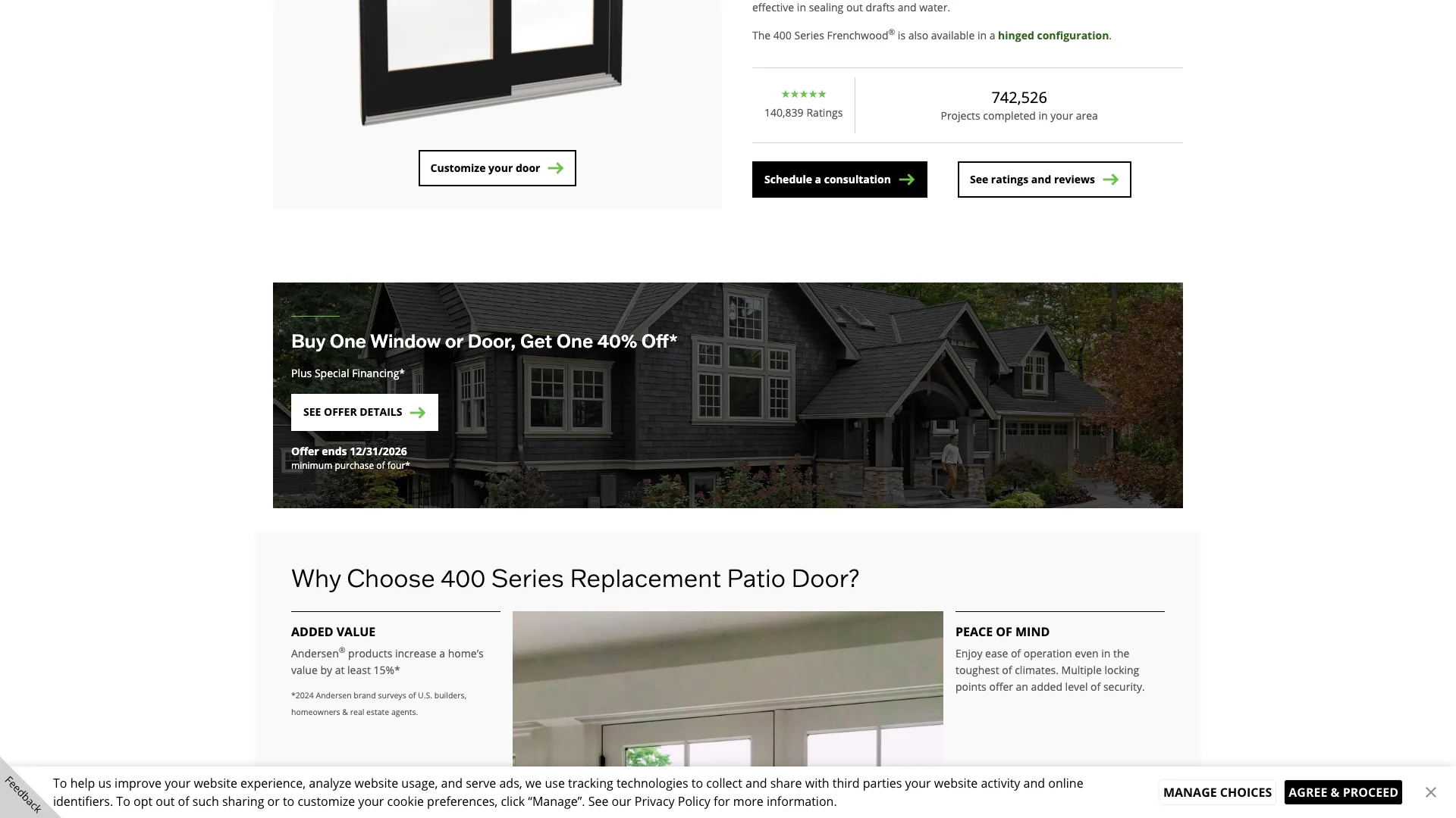
- 400 series patio door page, the product page for the 400 series patio door (1.2K monthly visitors, 2% share, scored 38, layout shift 0.000, 3 forms)
And the audit revealed a split personality. Google Reviews are present on 2 of 3 pages. Trust badges are present on 2 of 3 pages. The entry ensemble page has 4,915 words of deep content. But the windows-doors page has a layout shift of 0.198 (content jumps around nearly 2x the acceptable limit as the page loads). All three pages scored between 38 and 40 on Google's mobile lab test. And the form count is thin: 1 form on two pages, 3 on the third. For a brand worth $280K in monthly traffic value, these are fixable problems leaving real money on the table.
The pattern across these three pages tells a consistent story: Renewal by Andersen has the pieces of a strong website (deep content, reviews, badges) but hasn't applied them consistently. One page has deep content, but the others might not. Two pages have reviews, but the third doesn't. Two pages have clean layout stability, but the third has the worst layout shift in the window brand batch. Consistency is the gap.
"25% of homeowners say trusting contractors is their top challenge when planning home improvement projects."
— Houzz Inc. (2025)
Performance: 38 to 40 on Google's mobile lab test, with a 0.198 layout shift
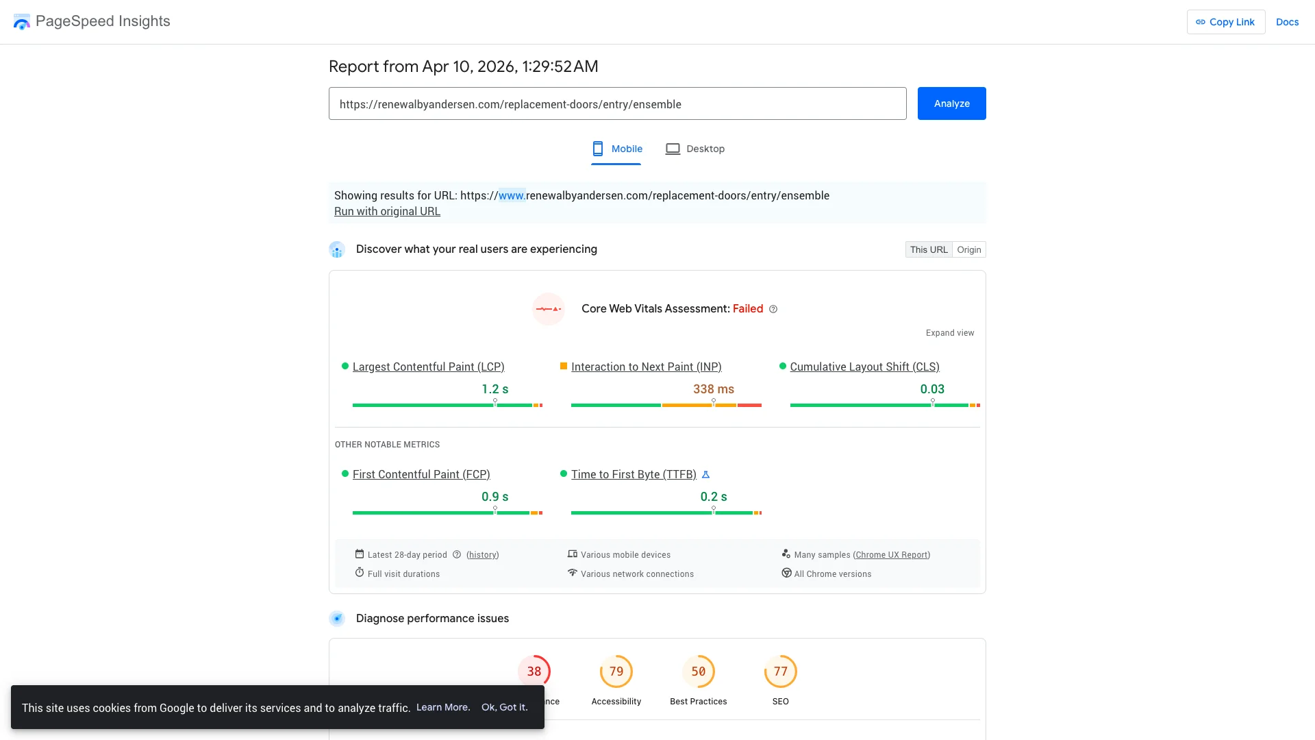
Google PageSpeed Insights runs a simulated slow-phone lab test. The scores are worst-case, not what you see on your phone with WiFi. But Google uses them as a ranking factor in search results.
The entry ensemble door page scored 40. The windows-doors page scored 39. The 400 series patio door page scored 38. All three are deep in the red zone. All three are eating a search-ranking penalty. For a brand pulling $280.2K in monthly traffic value, every ranking position lost to poor page speed translates to thousands of dollars in organic traffic value that Google is routing to faster competitors instead.
"53% of mobile users abandon sites that take longer than 3 seconds to load."
— Google / SOASTA (2017)
But the layout shift problem on the windows-doors page is worse than the speed scores. That page has a cumulative layout shift of 0.198. The acceptable limit is 0.1. So content on the windows-doors page jumps around nearly twice what Google considers acceptable as the page loads. That's the one performance metric homeowners can actually feel on their own device. Text they're reading suddenly moves. A button they were about to tap shifts position. An image pops in and shoves everything down. It's frustrating, and it makes the page feel broken even if it technically works.
The other two pages are clean on layout shift. The entry ensemble page scores 0.001. The patio door page scores 0.000. So it's not a site-wide problem. Something specific about the windows-doors page (probably a hero image without defined dimensions, a dynamically loaded banner, or a promotional element that injects itself after the page renders) is causing that shift. And with 1.2K monthly visitors hitting that page, roughly 1,200 homeowners a month are experiencing content jumping around on their screen.
The combination of a 39 performance score and a 0.198 layout shift makes the windows-doors page the weakest page in this teardown by a wide margin. The performance score tells Google the page is slow. The layout shift tells homeowners the page is unstable. Both are fixable, but the layout shift should be the priority because it's the one that directly impacts user experience on every device, regardless of connection speed.
Compounding effect
"Conversion rates drop approximately 12% for each additional second of page load time."
— Google / Deloitte (2020)
Lead capture: 1 form on most pages, 3 on the patio door
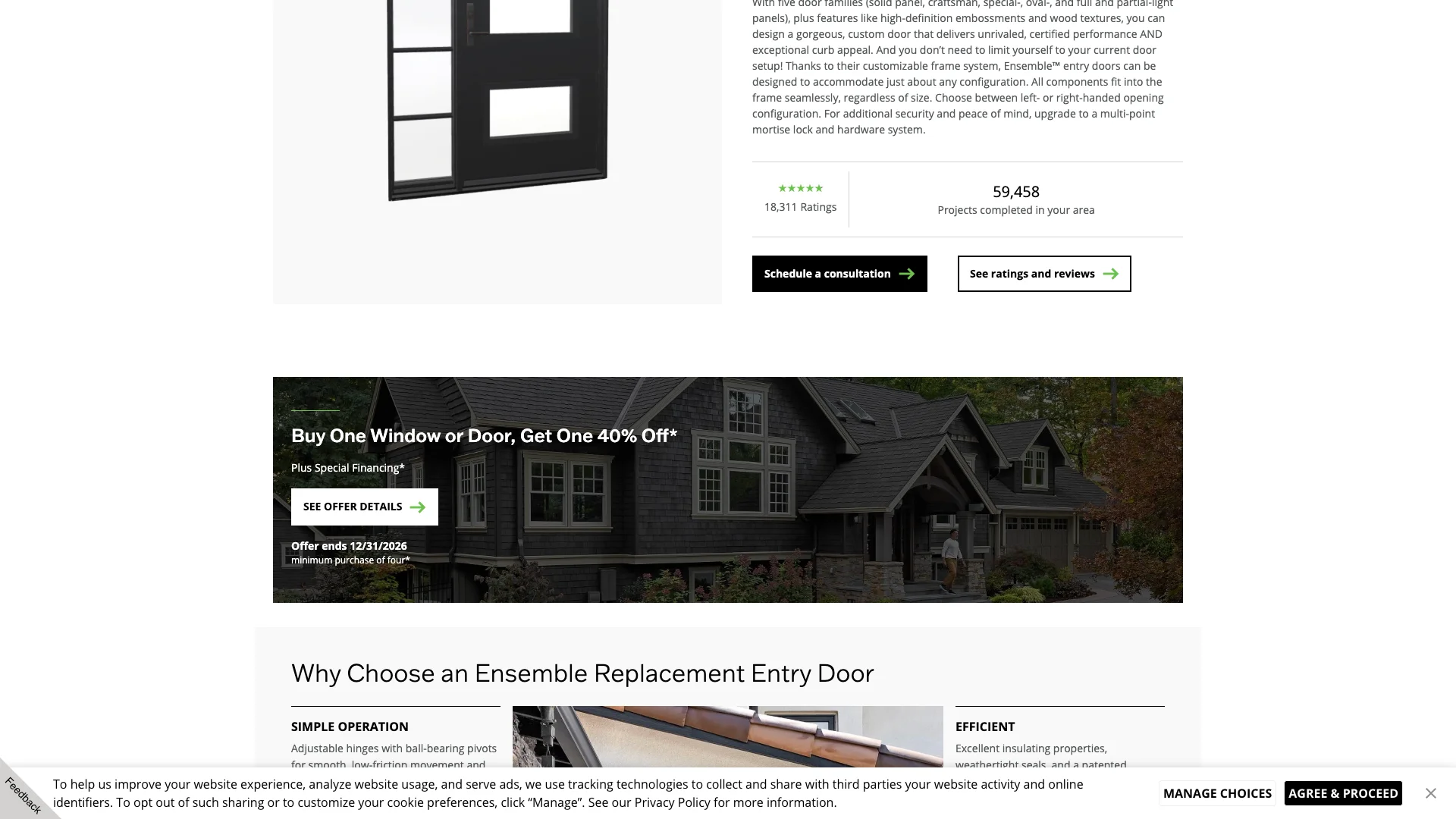
The form count on Renewal by Andersen is surprisingly thin for a brand this size. The entry ensemble door page has 1 form. The windows-doors page has 1 form. The 400 series patio door page has 3 forms. So two out of three product pages give the homeowner exactly one opportunity to submit their information.
One form per page means the form is probably in the hero or at the top of the page. A homeowner who isn't ready to schedule a consultation when they first land on the page has to scroll all the way back to the top to find the form after they've read the content and decided they're interested. That's a conversion gap. The homeowner who scrolls past the hero form and reads 3,000 words of product information should find another form waiting at the point where they finish reading. They shouldn't have to scroll back up.
"68% of users wouldn't submit a form if it required too much personal information."
— Baymard Institute (2024)
The 400 series patio door page with 3 forms is the better model. Three forms means there's a form near the top, one mid-page, and one near the bottom. That covers the ready-to-act visitor, the still-deciding visitor, and the convinced-by-the-content visitor. The entry ensemble page and the windows-doors page should match that pattern. If Renewal by Andersen added 2 more forms to each of those pages (one mid-page, one at the bottom), the conversion rate improvement would be measurable within a month.
And for context, Dreamstyle Remodeling (119 monthly visitors) runs 6 forms per page. Ideal Siding runs 4 forms per location page. Renewal by Andersen, with $280K in traffic value, runs 1 form on its main product pages. The biggest brand has the fewest conversion paths. That's not a budget limitation. It's a strategic choice that's costing them leads.
The entry ensemble page is especially concerning because it has 4,915 words of content. A homeowner reading through nearly 5,000 words of door specifications, design options, and material comparisons is engaged. They're interested. They're researching. And when they finish reading, they should see a form that says "Ready to see these doors in person? Schedule a free consultation." Instead, they have to scroll 4,915 words back to the top. That's the definition of a conversion leak: an engaged homeowner who can't find the form when they're ready to use it.
Trust signals: present on most pages, missing on the one with the worst layout shift
The trust signal audit reveals an inconsistency across pages:
- Google Reviews: Present on 2 of 3 pages (entry ensemble and patio door). Not present on the windows-doors page.
- Trust badges: Present on 2 of 3 pages. Not present on the windows-doors page.
- Review widgets: Not found separately.
- Chat widget: Not found.
- BBB badge: Not found.
- Certifications: Not found separately.
So the windows-doors page (the one with the 0.198 layout shift) is also the one missing Google Reviews and trust badges. That's the worst combination. A homeowner lands on a page where content jumps around on their screen, and there are no reviews or badges to build confidence. One form. No reviews. No badges. Content shifting nearly 2x the limit. That page is the weakest link in the entire Renewal by Andersen product section.
Comparison
"83% of consumers use Google to find local business reviews; 74% use two or more review platforms when researching."
— BrightLocal (2025)
The entry ensemble and patio door pages are better. Reviews present. Badges present. Those pages have social proof that the windows-doors page is missing. But even on those pages, there's no chat widget. No BBB badge. No separate certification badges. So the trust layer is partial. It's better than Window World (zero across the board), but it's not as complete as TrueDecks (reviews, badges, widgets, and chat on every page).
The inconsistency across pages is the real problem. A homeowner browsing multiple product pages will notice that one page has reviews and badges while another doesn't. That inconsistency can feel like the company is selectively displaying reviews (only on pages where reviews are good) rather than being transparent across the board. Whether that's the actual reason or not, the perception matters. And perception drives conversions.
For a premium brand like Renewal by Andersen, trust signals matter even more than they do for budget brands. Homeowners choosing Renewal by Andersen are spending 20-40% more than they would with a standard window installer. They need extra reassurance that the premium price is justified. Reviews from homeowners who paid the premium and were satisfied provide that reassurance. Badges from industry certifications reinforce it. The windows-doors page offers neither, and it's asking homeowners to commit to a premium consultation with zero social proof on the page.
"48% of customers say that if a site does not work well on mobile, it signals the company does not care about their business."
— Google Consumer Insights (2018)
What Renewal by Andersen does well
Renewal by Andersen gets two things right that deserve credit, and one of them is exceptional.
Deep content on the entry ensemble page. 4,915 words. That's the deepest content on any single page in the CRO Index window and door batch. It covers product specifications, design options, installation details, and material comparisons. A homeowner researching entry doors will finish reading that page feeling informed. That's what deep content does. It doesn't just help with search rankings (though it does). It builds the homeowner's confidence in the product, which increases the likelihood they'll fill out the form. Window World's entry doors page has 592 words. Renewal by Andersen's has 4,915. That's an 8x content depth advantage on the same product category.
Google Reviews and trust badges on the product pages that have them. The entry ensemble and patio door pages both render Google Reviews and display trust badges. That's the combination that makes a product page feel credible. Reviews show social proof from real customers. Badges show third-party validation. Together, they reduce the friction between "I'm interested" and "I'll fill out this form." The problem is that the windows-doors page doesn't have either. But on the pages where they're present, the execution is solid.
"64% of homeowners say having recommendations or references is a top-three factor in choosing a contractor."
— Houzz Inc. (2025)
These strengths make the gaps more frustrating. Renewal by Andersen clearly has the content team to write deep product pages and the technical setup to render reviews and badges. The question is why those capabilities aren't applied consistently across every product page. The entry ensemble page proves what's possible. The windows-doors page shows what happens when the same standards aren't applied everywhere.
What the gaps mean for window contractors
Renewal by Andersen is the example of what happens when a big brand has strong pieces in isolation but doesn't connect them consistently. If you're a window contractor reading this, the lessons are about consistency and the one metric homeowners can feel.
Fix layout shift before anything else. A 0.198 layout shift on the windows-doors page means content jumps around nearly 2x the acceptable limit as the page loads. Homeowners feel that. They're reading about window options and the text suddenly moves. They're about to tap a button and it shifts position. That experience makes the page feel unreliable, and it makes the brand feel unreliable by association. If you have a layout shift above 0.1 on any page, fix it before investing in new content, new forms, or new marketing campaigns. Define dimensions on every image. Reserve space for dynamically loaded elements. Test every page on a real phone after each deployment.
Put reviews and badges on every product page, not just some. Renewal by Andersen has reviews and badges on 2 of 3 tested pages. The page without them (windows-doors) is the one with the worst performance metrics. That's probably coincidental, but the pattern sends a signal to homeowners: "We show reviews on some pages but not others." Your trust signals should be consistent. Every product page, every service page, every location page should have the same review widget and the same trust badges. If you've earned the reviews and certifications, display them everywhere.
Add more forms to product pages. Renewal by Andersen runs 1 form on two of its three tested product pages. If you're writing a 3,000-word product page, put a form at three scroll depths: top, middle, bottom. The homeowner who reads 4,915 words of entry door content and reaches the bottom of the page should find a form right there, not have to scroll back to the top. For a brand driving $280K in monthly traffic value, adding 2 forms to each product page could generate measurable revenue within 30 days.
Write deeper content on every page. The entry ensemble page has 4,915 words. If Renewal by Andersen can write 4,915 words for entry doors, they can do the same for windows and patio doors. And if you're a smaller window contractor, the takeaway is that the biggest brand in the category is winning on content depth. You won't out-budget them on marketing, but you can match or exceed them on content. A 3,000-word replacement windows page covering product types, materials, energy ratings, installation process, and warranty details puts you in the same conversation as a $280K-traffic-value brand.
Treat every page like your best page. The entry ensemble page has deep content, reviews, and badges. The windows-doors page has none of those plus a layout shift problem. If you're running multiple product pages, your weakest page defines your brand's floor. A homeowner who visits your best page and then clicks to your worst page doesn't average the two experiences. They remember the worst one. Audit every page individually. Bring every page up to the standard of your best one. That consistency is what separates brands that convert from brands that just get traffic.
"48% of customers say that if a site does not work well on mobile, it signals the company does not care about their business."
— Google Consumer Insights (2018)
Frequently asked questions
Does Renewal by Andersen have a layout shift problem?
Yes. The windows-doors page has a cumulative layout shift of 0.198, which means content jumps around nearly 2x the acceptable limit (0.1) as the page loads. That's the one performance metric homeowners can actually feel on their device. The other two tested pages are clean (0.001 and 0.000), so it's not a site-wide issue. It's specific to the windows-doors page.
How does Renewal by Andersen score on Google's mobile lab test?
The entry ensemble door page scored 40. The windows-doors page scored 39. The 400 series patio door page scored 38. All three are in the red zone, eating a search-ranking penalty. For a brand with a $280.2K traffic value, these scores represent a significant ranking ceiling.
Does Renewal by Andersen display Google Reviews?
Google Reviews are present on 2 of the 3 tested pages (entry ensemble and patio door). The windows-doors page does not display reviews. Trust badges follow the same 2-of-3 pattern. So the trust setup is partially there, but inconsistent across pages.
How much organic traffic does renewalbyandersen.com get?
According to Ahrefs data from March 2026, renewalbyandersen.com receives approximately 59.5K monthly organic visitors with an estimated traffic value of $280.2K. The entry ensemble door page accounts for 2.3K visitors (4% share). The windows-doors page accounts for 1.2K (2%). The 400 series patio door page accounts for 1.2K (2%).