What happens when you audit Re‑Bath, trusted by over 30,000 homeowners with a 4.7 star average? You uncover buried 5-star social proof, bloated lead forms, and a site whispering beauty while ignoring safety, speed, and elderly trust. Here’s exactly how I’d fix their funnel.
Read Time
10 mins
Category
Lead Leak Audit
Written by
Nenyi Keborku
Published on
Oct 7, 2025
Vague & Passive
No value proposition
Too much, too soon
Join The Crew to receive clear emails, built to help you convert more.
By subscribing you agree to with our Privacy Policy
Here’s the dirty truth no one wants to admit at marketing conferences:
Even great brands leak.
That’s why I ran this teardown.
This is what I’d do if Re-Bath asked us to redesign their digital sales path, from scroll to schedule. Because your website should work harder than your best closer.
They’re not chasing beauty. They’re craving certainty.

What the hell does that mean?
It’s a mismatch. Aesthetic copy for an audience that needs emotional security.
And in CRO? Mismatch kills momentum.
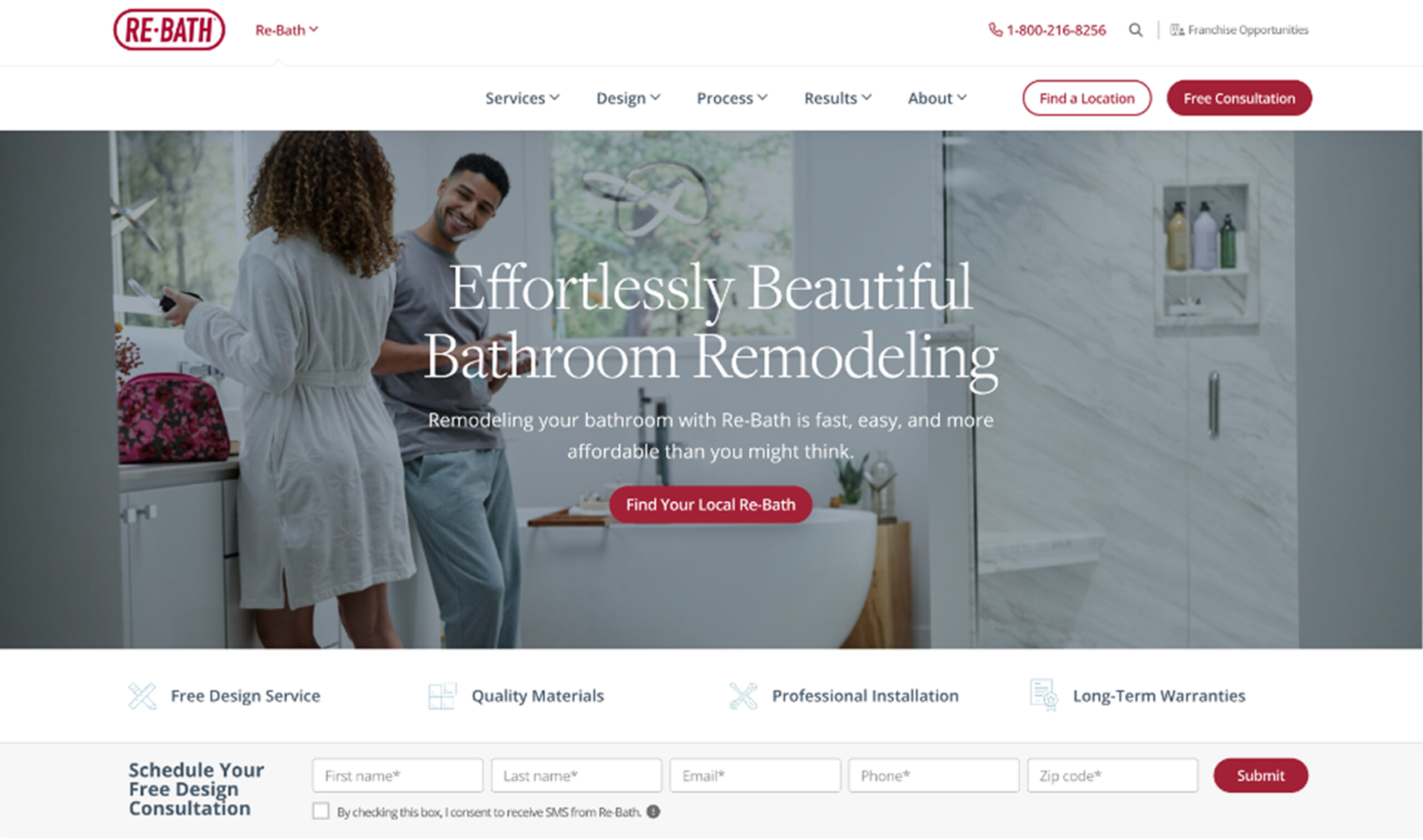
Current headline:
Vague & Passive, like Beige tile.
Let’s reimagine for the actual buyer:


CRO Insight: In high-consideration verticals like remodelling and roofing, trust indicators (like reviews and guarantees) placed above the fold consistently reduce bounce and hesitation.
This is based on observed UX research patterns and CRO test results from adjacent industries where trust is a major conversion driver. In industries like these, hesitation isn’t a maybe, it’s a no.
Somewhere mid-page:
“30,000+ 5-star reviews. 4.7 average rating.”
And they bury it.
If I’m 62, nervous about spending $15K+… 30,000 reviews isn’t just nice. It’s relief, it’s proof I’m not alone, it’s permission to take the next step.
Fix it: Put this above the fold.

CRO Insight: Trust above the fold can reduce bounce by 20% or more in high-friction industries, a pattern observed across studies from Baymard, CXL, and dozens of published CRO tests.
We’ve built our audits on those proven patterns—so even without analytics, the fixes we suggest are grounded in what works.

Current CTA:
“Schedule Your Free Design Consultation”
Sounds like a meeting. Sounds like work.
Let’s try giving instead of asking.

Test These CTAs:
Better buttons. More curiosity. Less resistance.
Mobile CTA Combo:
“Get Your Remodel Plan in 2 Minutes”
[ Start Here ]
You’ve now:
Current setup:
Name. Email. Phone. ZIP. City. State. Blood type. Favourite child.
They’re asking too much, too soon.
Principle: Progressive Disclosure
Step 1:
[ Enter ZIP Code ] → [ Check Availability ]

Step 2 (if yes):
Great news! We serve your area. Want your Remodel Plan? [ First name ] [ Email ] [ Optional Phone ] → [ Continue ]

Optional fallback:
“Not ready? Get our 5-point Remodel Prep Guide.”
Capture high-intent and low-commitment leads.

You’ve got HGTV’s Jenny Marrs. And she’s mid-scroll?
No.
She’s trust-on-a-platter. Bring her up high.
New Headline:
Loved on HGTV. Now Built in Your Bathroom.
Copy:
“Design should be beautiful—but it should also make life easier.” — Jenny Marrs
CTA:
[ Explore the Jenny Marrs Collection → ]
Optional: 30s video. Carousel. As-seen-on HGTV badge. Use it.


First 30 Days – Quick Wins
Next 30–60 Days – Deepen Funnel
Then: Add hotjar heatmaps, scroll maps, and session replays.
But even without data? The structure, the story, the CTA logic, they’re all fixable now.